Another gem of WPF is the ability to poll a data bound item for errors. This is done by implementing IDataErrorInfo in your entities (support was added into WPF in .NET 3.5).
The interface adds a string property "Error" and a string indexer. The indexer accepts a property name and returns the error detail. A simple implementation for the indexer for our Product class (continued from my previous posts in this WPF series) follows:
public string this[string columnName]

{

    get

    {

        var field = (FieldNames) Enum.Parse(typeof (FieldNames), columnName);

        switch (field)

        {

            case FieldNames.Inventory:

                if (Inventory < 0)

                {

                    return "Inventory can not be less than zero";

                }

                break;

            case FieldNames.ModelName:

                if (ModelName.Contains("XXX"))

                {

                    return "Our Store does not support adult content.";

                }

                break;

            case FieldNames.Price:

                if (Price < 0)

                {

                    return "Price can not be less than zero";

                }

                break;

            default:

                break;

        }

        return string.Empty;

    }

}

public string Error

{

    get { throw new NotImplementedException(); }

}
The key to the indexer is the string value that is returned. If the returned value is string.Empty or null, there is no error. Otherwise an error condition exists. In my simple example, the code considers a negative Inventory or Price to be an error condition, along with finding "XXX" in the ModelName.
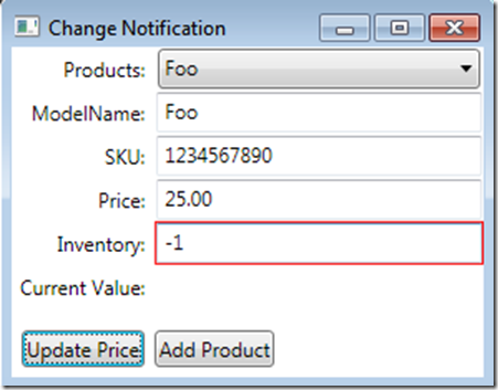
To have the WPF Window display an error condition simply add the ValidatesOnDataErrors=true attribute to the binding. This uses the default error skin (thin red border) to graphically show the error condition. The updated XAML for the Inventory Text Box is updated to this:
<TextBox Grid.Row="3" Grid.Column="1" Margin="1,1,1,1" HorizontalAlignment="Stretch"

     Text="{Binding ElementName=ProductSelector, Path=SelectedItem.Inventory, ValidatesOnDataErrors=true}" />
The resulting UI appearance shown with a negative Inventory value is shown here:

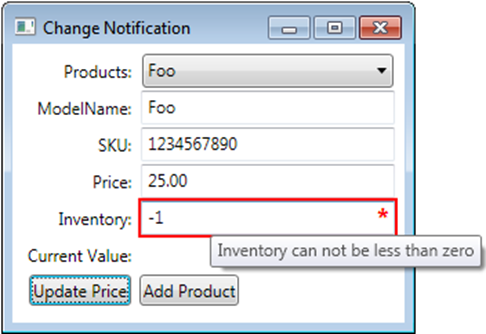
If you need more information supplied to the user, you don't have to use the default error template. The thin red line doesn't convey enough information to the user, and is more detrimental than beneficial. At a minimum, the tool tip for the control needs to be set to the error text, and a more visual indicator that there is an issue.

To do this, we are going to create a style that replaces the default error template. The sample here only applies to Text Boxes, but can be simply extended for other controls.
To set the ToolTip for the control, we use a Style Trigger that will be activated when the Validation.HasError property is true (this property is a benefit of IDataErrorInfo). The Binding expression refers back to itself, and in the Path, we need to surround Validation.Errors in parentheses to indicate that it's an attached property as opposed to a property of the TextBox.
<Style.Triggers>

    <Trigger Property="Validation.HasError" Value="true">

        <Setter Property="ToolTip"

          Value="{Binding RelativeSource={x:Static RelativeSource.Self},
/>

          Path=(Validation.Errors)[0].ErrorContent}"
    </Trigger>

</Style.Triggers>
The complete style (shown in the next code block) adds the red border and the asterisk as a replacement for Validation.ErrorTemplate, the default error template.
<Style TargetType="{x:Type TextBox}">

    <Setter Property="Validation.ErrorTemplate">

        <Setter.Value>

            <ControlTemplate>

                <DockPanel LastChildFill="True">

                    <TextBlock DockPanel.Dock="Right"

                       Foreground="Red"

                       FontSize="14pt"

                       Margin="-15,0,0,0" FontWeight="Bold">*

                    </TextBlock>

                    <Border BorderBrush="Red" BorderThickness="1">

                        <AdornedElementPlaceholder Name="controlWithError"/>

                    </Border>

                </DockPanel>

            </ControlTemplate>

        </Setter.Value>

    </Setter>

    <Style.Triggers>

        <Trigger Property="Validation.HasError" Value="true">

            <Setter Property="ToolTip"

                Value="{Binding RelativeSource={x:Static RelativeSource.Self},
/>

                Path=(Validation.Errors)[0].ErrorContent}"
        </Trigger>

    </Style.Triggers>

</Style>
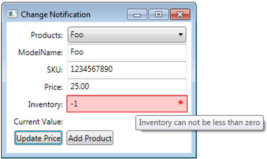
The ErrorTemplate resides in the Adorner layer. This allows for creating templates that appear to change the control being adorned. By adding an additional border (with a Background="Red" Opacity="0.2"), we can create the look below, which is much more pronounced.

When the additional border with a background is added, the ToolTip on the TextBox never displays since the adorner captures the hover. To solve this, we move the ToolTip to the DockPanel in the ErrorTemplate. We now reference the name we gave the AdornedElementPlaceholder in our binding, and the ToolTip is back.
<Style TargetType="{x:Type TextBox}">

    <Setter Property="Validation.ErrorTemplate">

        <Setter.Value>

            <ControlTemplate>

                <DockPanel LastChildFill="True"

                           ToolTip="{Binding ElementName=controlWithError,Path=AdornedElement.(Validation.Errors)[0].ErrorContent}">

                    <TextBlock DockPanel.Dock="Right"

                       Foreground="Red"

                       FontSize="14pt"

                       Margin="-15,0,0,0" FontWeight="Bold">*

                    </TextBlock>

                    <Border BorderBrush="Red" BorderThickness="1">

                    <Border Background="Red" Opacity="0.2">

                        <AdornedElementPlaceholder Name="controlWithError"/>

                    </Border>

                    </Border>

                </DockPanel>

            </ControlTemplate>

        </Setter.Value>

    </Setter>

</Style>
Updated 7/26/2009
There is an issue with the XAML above, in that the mouse clicks are swallowed by the Borders, and the text box doesn't receive them. The solution to this is simple, and that is combining the Validation.ErrorTemplate property setter with Style Triggers. The corrected XAML is below:
<Style TargetType="{x:Type TextBox}">

    <Style.Triggers>

        <Trigger Property="Validation.HasError" Value="true">

            <Setter Property="Background" Value="Pink"/>

            <Setter Property="Foreground" Value="Black"/>

        </Trigger>

    </Style.Triggers>

    <Setter Property="Validation.ErrorTemplate">

        <Setter.Value>

            <ControlTemplate>

                <DockPanel LastChildFill="True"

                   ToolTip="{Binding ElementName=controlWithError,Path=AdornedElement.(Validation.Errors)[0].ErrorContent}">

                    <TextBlock DockPanel.Dock="Right"

                       Foreground="Red"

                       FontSize="14pt"

                       Margin="-15,0,0,0" FontWeight="Bold">*

                    </TextBlock>

                    <Border BorderBrush="Red" BorderThickness="1">

                    <AdornedElementPlaceholder Name="controlWithError" />

                    </Border>

                </DockPanel>

            </ControlTemplate>

        </Setter.Value>

    </Setter>

</Style>
In my next post, we look at evaluating error conditions based on multiple properties.
Happy Coding!