WPF introduces an entirely new (and long over due) Menu (and ContextMenu)
controls. The new controls are full fledged members of the WPF hierarchy,
and not merely wrappers for Win32 classes.
Since the menus are full fledged controls in WPF world, you have the freedom
to do all kinds of techniques that you probably shouldn't (such as playing video
in a menu). This posts focuses on the more practical, real world
development examples to get menus up and running in your WPF applications.
First Simple Menu
To create your first WPF menu, create a new form with a GridPanel.
Create two rows in the grid panel; set the first row height to 26 and the second
row height to "*".
    <Grid Name="grid1">
        <Grid.RowDefinitions>
            <RowDefinition Height="26" />
            <RowDefinition Height="*" />
        </Grid.RowDefinitions>
    </Grid>
There are two ways to add a Menu control to your form: you can drag/drop a menu control
onto the form or you can edit the XAML directly. Starting out, you will probably do
the "drag/droppy" method until you start to get a good feel for the tags created by the controls.
Drag and drop a "Menu" control from the toolbox onto the first row of your
grid. Depending on where you release the mouse, it could look pretty
strange. For example, my menu ended up with the markup:
<Menu Margin="0,0,0,4" Name="menu1" HorizontalAlignment="Left"
Width="200"/>
If you want the menu to cover the entire width of your grid, you will want to
change the markup to the following:
<Menu Name="menu1" HorizontalAlignment="Stretch"/>
Detour: IsMainMenu Quirks

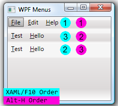
Figure 1
The "IsMainMenu" property is exposed by the Menu class, and makes the menu
perform as expected when the user presses the Alt or the F10 keys. This
property is set to true by default for every menu added to your form.
So, if you have multiple menus on your form, they will all try to get
focus when the user presses Alt or F10. The winning menu is the one that
appears first in the XAML, not visually on the form. The user can
then tab through all of the menu items, rotating through the menus in markup
position order (see Figure 1).
If the user presses Alt + <access key> to access menu items, the menus are
processed in the order they appear visually on the form. If you
have three menus as in Figure 1, holding down the Alt key and pressing "H" three
times will highlight the menus in top to bottom order.
Back to Main Road: Adding Menu Items
If you've done WinForms development, you'll probably love the fact that
adding menu items is as easy as writing XML. (Of course, if angle brackets
get you down, there's always the designer).
The <MenuItem> class defines a (no surprise here) Menu Item, which is to say
they represent the visible portion of the menu. In addition to all of the
WPF features of visual elements, there are several important
attributes/properties that come into play. The first is the Header, and
this is what gets rendered as the text of your menu item. An important
change from WinForms, is that we no longer use an ampersand (&) to denote an
access key. Since we are now dealing with XML, it has been replaced with
the underscore (_). If you want to have an underscore in your Header,
place two underscores back to back (just like we did in WinForms with the &).
If you want to have an underscore immediately
preceding your access key, place three underscores in a row.
MenuItems that act as a container for other MenuItems simply have MenuItem
tags inside themselves. Also, MenuItems can:
- Display graphics (ala icons) in the left margin of the MenuItem - set
the IsCheckable property to true - Be Checked (toggle the display of a checkbox when
clicked) - note that the check mark supersedes the icon - Contain Shortcut Text (e.g. Ctl+P) to the right of the menu text as defined
by the InputGestures property - best controlled by an associated Command object
(more on this in the next section).
MenuItems that do something are much more interesting in WPF due to
the Command and RoutedEvent architecture. You can still respond to the Click
event of the MenuItem, but this brings us right back to the issues that we had
in WinForms. What if you have a MainMenu with a "Print" MenuItem, a
ContextMenu with "Print" MenuItem, and a ToolBar with a "Print" ToolBarButton.
All three of those click events would need to be coded to call the Print method
in code. Certainly do-able, but most assuredly a royal pain.
Commands
The WPF Command Model has four key parts:
- Commands - Command objects represent a unit of work and keep track of
whether or not it can be executed - Command Bindings - binds the command to the associated application code
- Command Sources - for menu, this is the MenuItem control that triggered
the command, and is exposed through ExecutedRoutedEventArgs.OriginalSource in the
Executed delegate. - Command Targets - the object that the Command is being executed against
(e.g. a TextBox receiving the Paste command). If this is not explicitly set,
it will be the control that currently has the keyboard focus.
Built-In Commands
There are 5 groups of built-in Command classes (derived from RoutedCommand)
that are available for use:
- Application Commands - such as New, Help, Find, etc.
- Component Commands - such as Move, MoveLeft, Scroll, etc.
- Editing Commands - contain Formatting and Editing commands (mostly for
word processor style documentation) - Navigation Commands - mostly browser/document navigation
- Media Commands - all related to playing media
Using a built in command where available saves you from coding the base
plumbing, so take a good look at what's available in these classes before you
start developing your own commands.
Implementing a Built In Command
It takes 3 steps to hook a built in Command to a MenuItem:
- Add Command="<Command Name>" to the MenuItem (e.g. "ApplicationCommand.New")
- Add a Binding (delegate for Executed and an optional delegate for
CanExecute) at the appropriate level in the control heirarchy - Add the appropriate code in the event handler(s).
Adding the Command to the MenuItem
Simply add the Command attribute in the markup with the appropriate value as
in this:
<MenuItem Header="_New" Command="ApplicationCommands.New"
/>
Fortunately, WPF is smart enough to assign the correct command if you only
specific Command="New". This also adds Ctl+N to the New MenuItem
as an access key combination. Additionally, the MenuItem will adopt the
Text of the command for the Header if a Header is not specified.
Unfortunately, for the built in commands, there is not an Access Key defined, so
you will lose that functionality if you don't specify the header yourself.
At this point, if you were to run the application, you would find that the
"New" MenuItem is disabled. This is because the command doesn't have any
bindings to execute, so it disables the control.
Adding Binding Information For Commands
Binding information can be set at the any level of the Control Hierarchy, but
is typically set at the level of the Window containing the Menu (otherwise
there's no point in using Commands...)
To add the binding information through code 1) create a new binding based on the
Command, 2) assign the event handlers, and then 3) add the binding to the container's
binding collection.
CommandBinding binding = new CommandBinding(ApplicationCommands.New);
binding.Executed +=New_Executed;
binding.CanExecute += New_CanExecute;
this.CommandBindings.Add(binding);
The same thing can also be done in
markup, but then you lose IntelliSense. (I still prefer to configure
bindings in markup.) The XAML version of the above Binding Information looks like this:
<Window.CommandBindings>
     <CommandBinding Command="ApplicationCommands.New"
          Executed="CommandBinding_Executed" CanExecute="CommandBinding_CanExecute"/>
</Window.CommandBindings>
CanExecute
CanExecute determines if the Command can be executed. This also will
enable/disable the control tied to the command based on the value that
CanExecuteRoutedEventArgs.CanExecute is set to. Note: If you are tying this to
the value of a control on the same window (e.g. a checkbox), make sure to check
the IsInitialized state prior to checking the value of the control.
PreviewCanExecute, PreviewExecuted
These events fire just prior to CanExecute and Executed. These can be used to
derail the "normal" handling of commands if necessary, just be careful of side
effects when using them. For example, you can disable a command in
PreviewCanExecute, but the visual indication will show as it does with the
CanExecute, so it can be confusing to the user.
Creating a Custom Command
Creating a reusable Custom Command is very straight forward. Make a
class to contain your custom Commands, instantiate them with the Text, Name,
Owning Class, and InputGestures, register your namespace in the XAML, and then
you can treat them as any of the built in commands.
Create the Custom Command Class
The class is simply a container for your custom commands. The real work is in
the constructor for the new RoutedUICommand. If you have an access key
that you know will be consistent across all uses of this command, you can
specify that in the Text property (as in "E_xit" in the sample below), and not
specify the Header property in your MenuItems.
public class FileCommands
{
   static FileCommands()
   {
      Exit = new RoutedUICommand(
         "E_xit","Exit",typeof(FileCommands),
  new InputGestureCollection
  { new KeyGesture(Key.X, ModifierKeys.Control, "Ctrl+X")});
   }
   public static RoutedUICommand Exit { get; private set;}
}
Register and Use Your Custom Command
To use your custom class declaratively in the markup, you must register your
namespace, as shown here:
<Window .... xmlns:cmds="clr-namespace:WPFSamples.Commands" .. >
Then, when you want to use your custom Command, reference it by prefix:name,
as in:
Command="cmds:FileCommands.Exit"
ContextMenus
Context Menus (access via Shift-F10 or right clicking on a control) are just
as easy to create. Apply your custom ContextMenu markup to the ContextMenu
dependency property for a control. The following example creates a context
menu for a GridPanel:
<Grid.ContextMenu>
 <ContextMenu>
  <MenuItem Header="Level One">
   <MenuItem Header="Level Two A"/>
   <MenuItem Header="Level Two B"/>
  </MenuItem>
 </ContextMenu>
</Grid.ContextMenu>
Separators

Figure 1
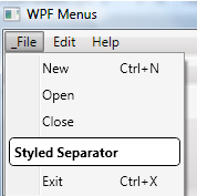
In hum-drum WinForms land, we were relegated to a horizontal line as a menu
separator. In WPF, the separator control can be jazzed up via templates.
The following sample will create the style separator as shown in Figure 2:
<Separator>
    <Separator.Template>
        <ControlTemplate>
            <Border CornerRadius="4" Padding="4" Background="White" BorderBrush="Black" BorderThickness="1">
                <TextBlock FontWeight="Bold">Styled Separator</TextBlock>
            </Border>
         </ControlTemplate>
    </Separator.Template>
</Separator>
Conclusion
Hopefully, this has shown you the basics of WPF menus. There is an
abundance of additional features that can be exploited, but this should get you
well on your way to building fully functional and efficient menu systems in your
application.
Happy Coding!